

Husky Hoops
During my time at the University of Washington, I had the great opportunity of creating the branding for the men’s basketball team for the 2019-20 season. This branding package was aimed to visually represent the gritty, competitive culture of the basketball program, led by Head Coach Mike Hopkins. This visual identity was used across various mediums, such as printed collateral, digital/social media graphics, and large-scale wall banners, while evolving throughout the season from non-conference games to conference games to the postseason conference tournament.
Theming Tougher Together
Non-conference tournaments and opponents allowed for more creative visuals, based upon the location and environment of competition.


Purple For The Pac
As the non-conference portion of the schedule concluded, it seemed natural to shift the duo-tone branding as the Huskies looked to take on their conference opponents in the Pac-12.


Visual Vegas Vibes
Continuing the trend of evolving this season’s branding led to this neon light concept. The Pac-12 Tournament was being held in Las Vegas, NV. So, similar the non-conference tournaments and opponents, it made sense to create these graphics that were inspired by The Entertainment Capitol of the World.


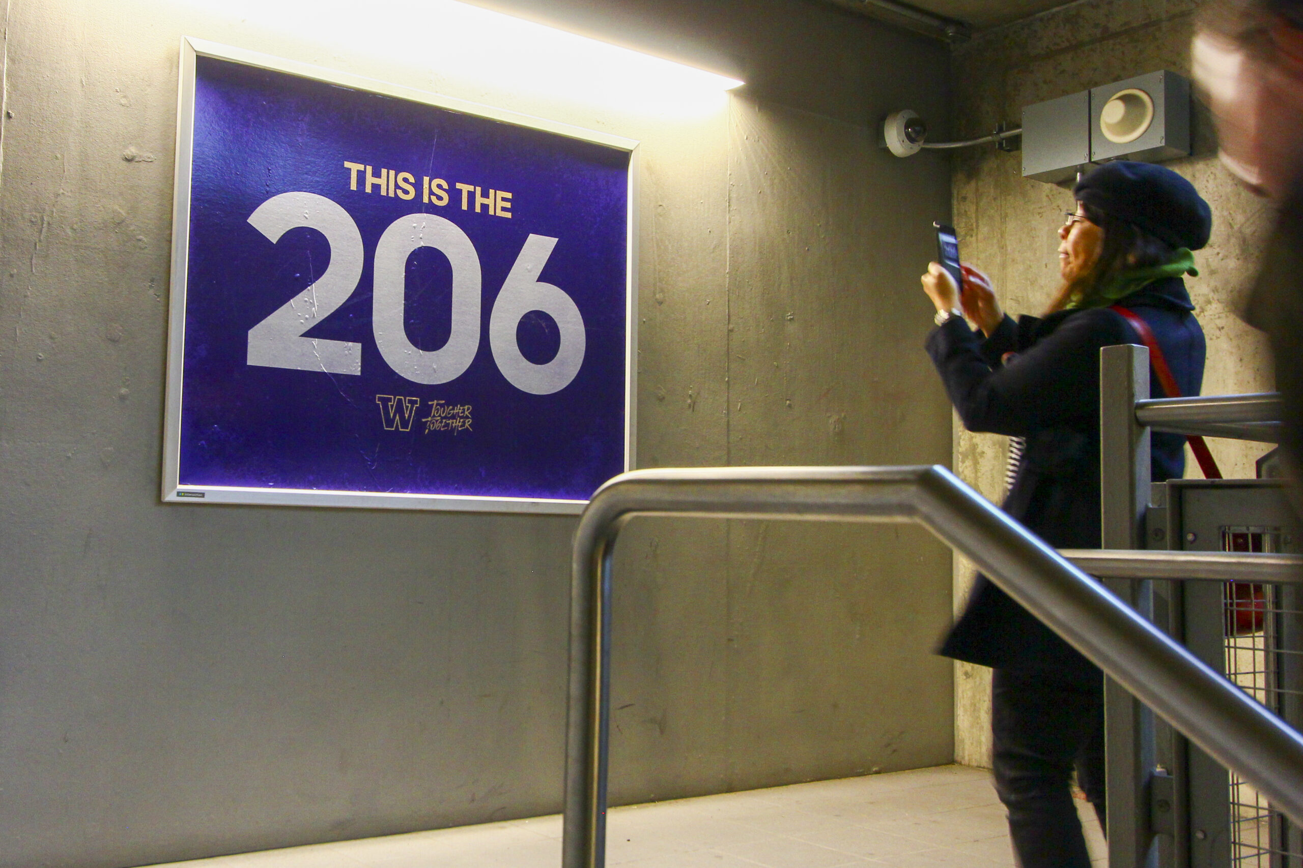
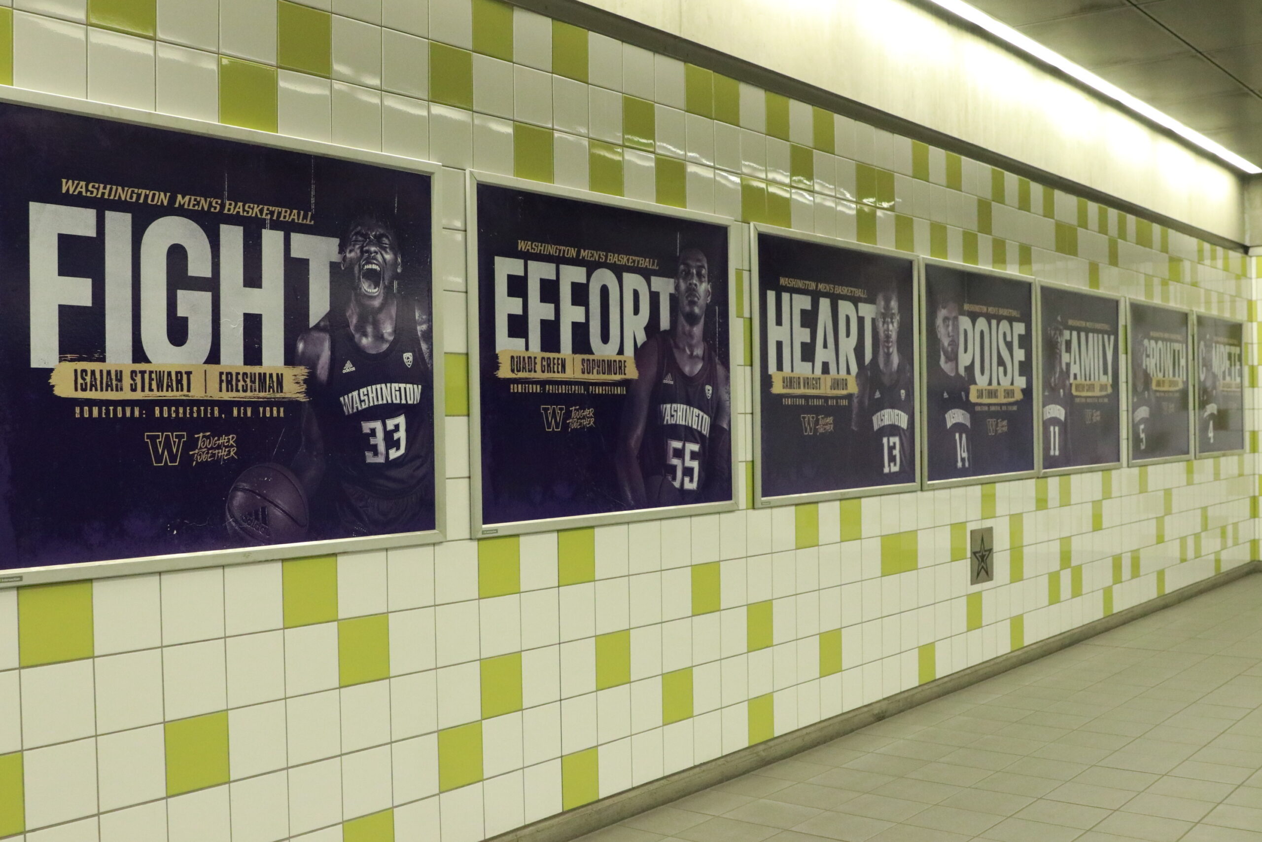
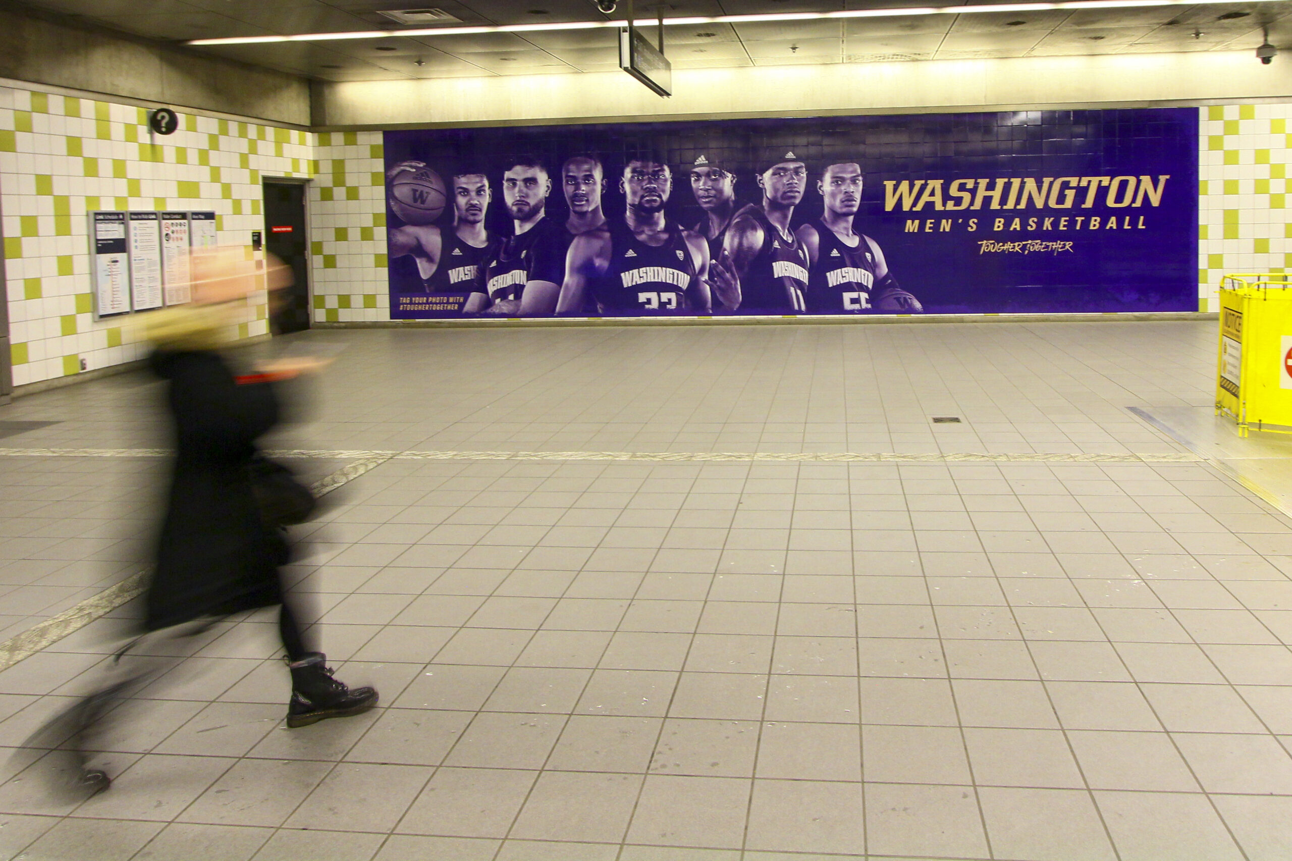
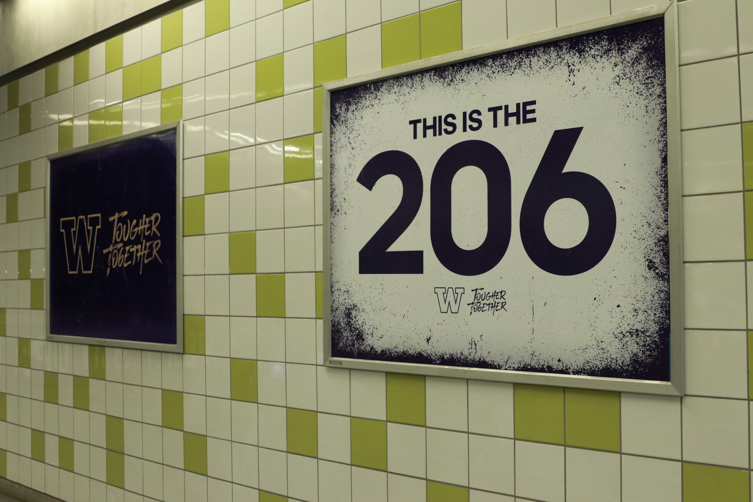
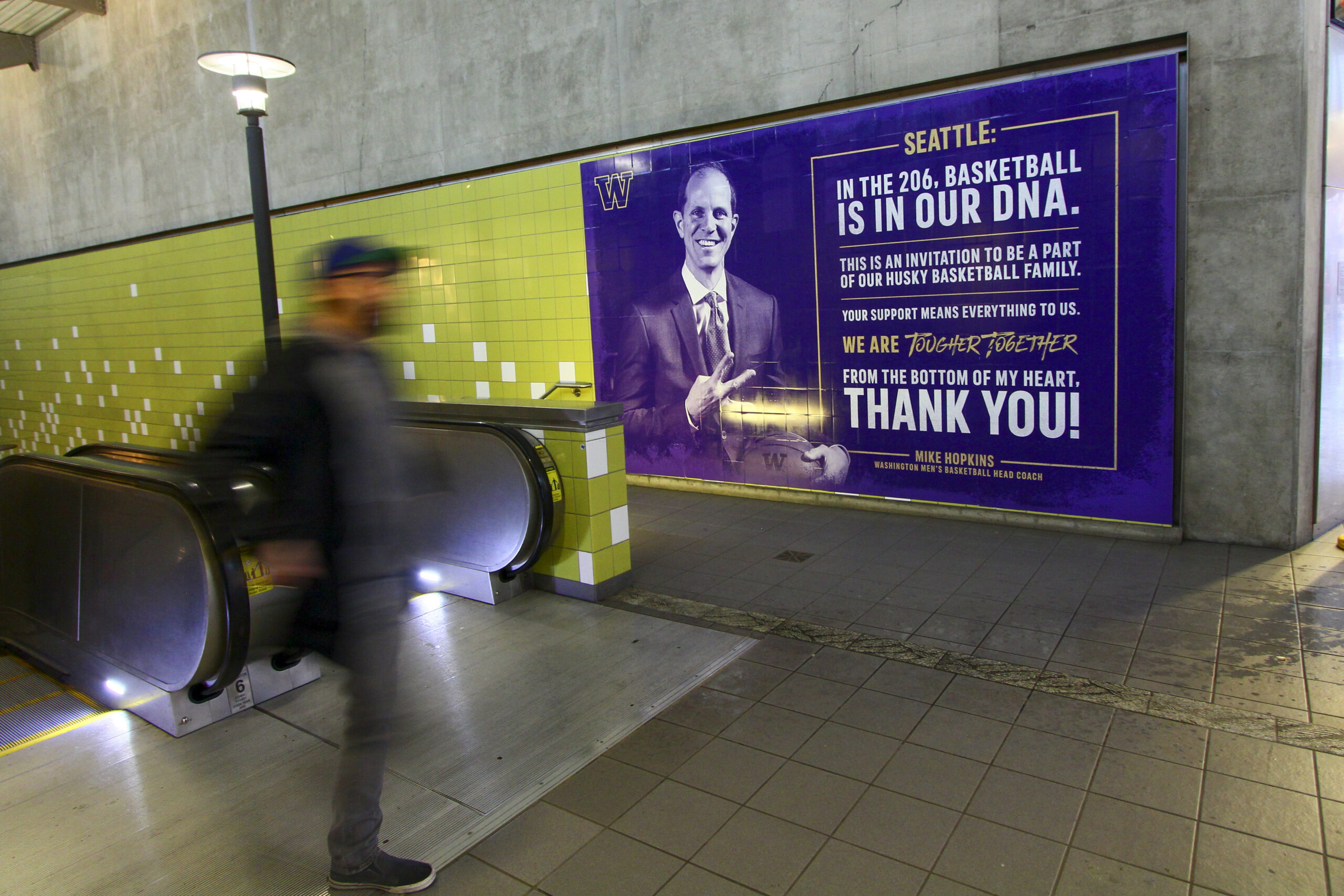
Lightrail Station Invasion
During the winter of 2019-20, our marketing department ended up having some additional funds leftover. Using those funds, we had the opportunity to completely takeover all of the signage at one of Seattle’s major lightrail stations, located at Capitol Hill, only one stop away from the University of Washington. This was by far the largest print project that I have worked on when it comes to surface area. These were also one of the most public-facing graphics that I have created, outside of the realm of sporting events. Although creating over 26 large-scale graphics was a grind, seeing the visual impact on the community and city was very rewarding.

Tougher Together 2.0
During the 2020-21 season, there was a lot of uncertainty in the world and for the basketball season. Thus, instead of completely rethinking the teams branding, it was an opportunity to evolve the visual branding in a familiar, yet fresh way.


