Rethinking Purple & Gold
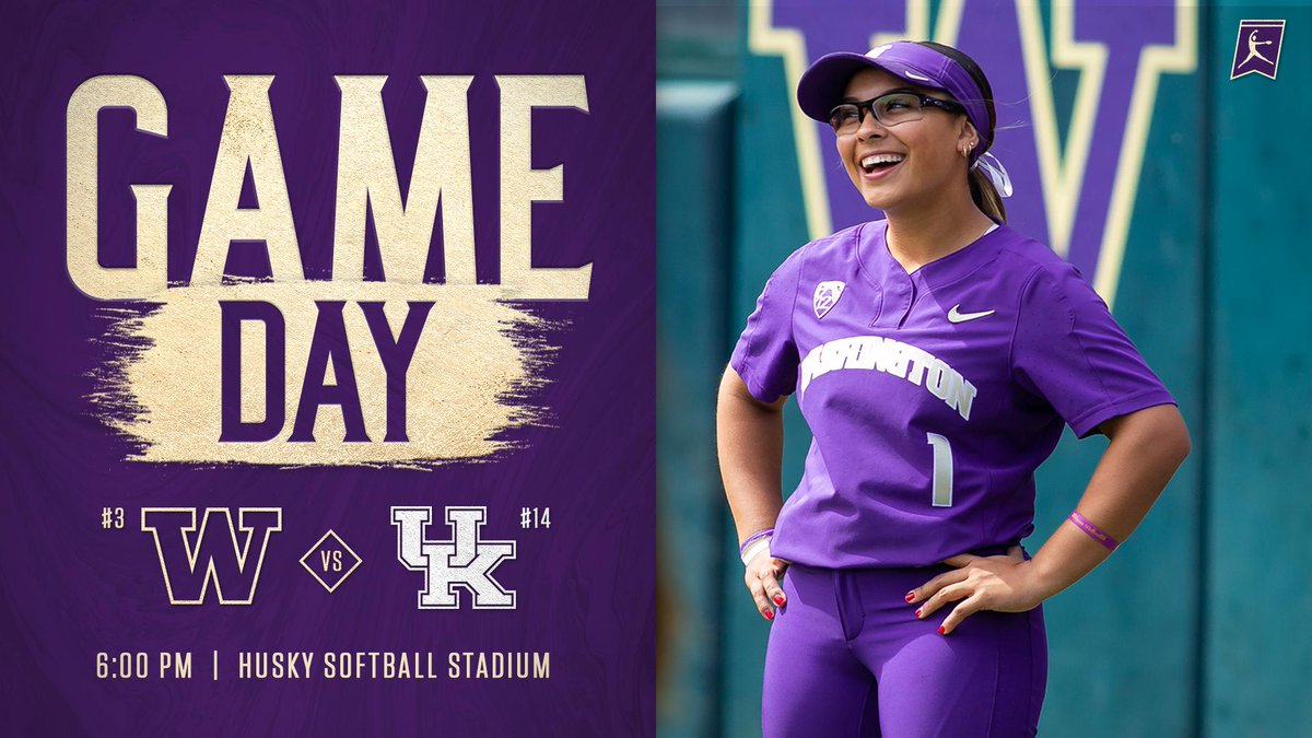
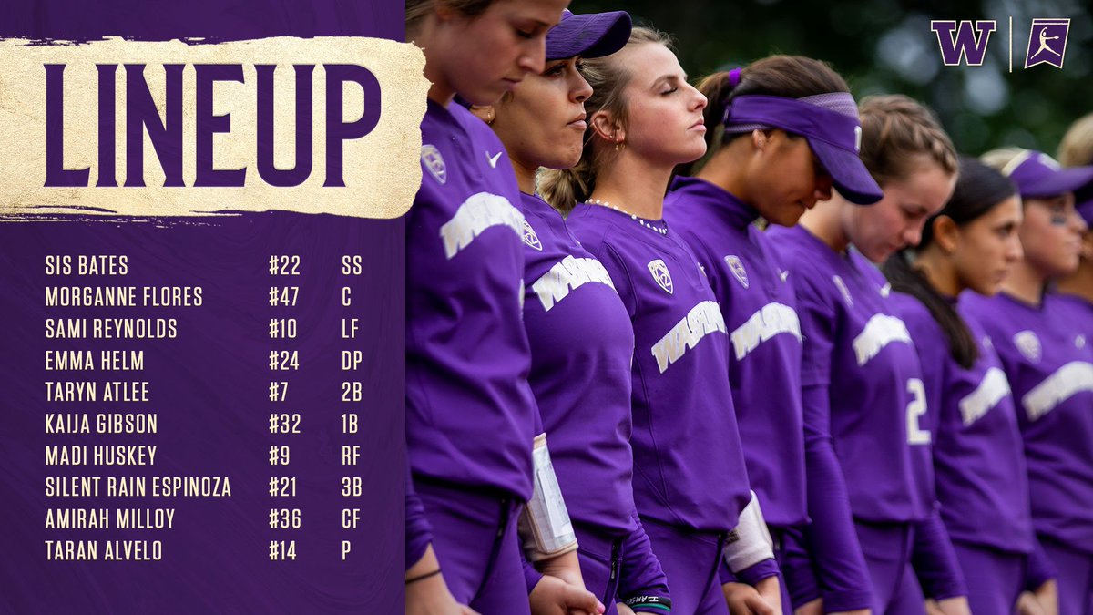
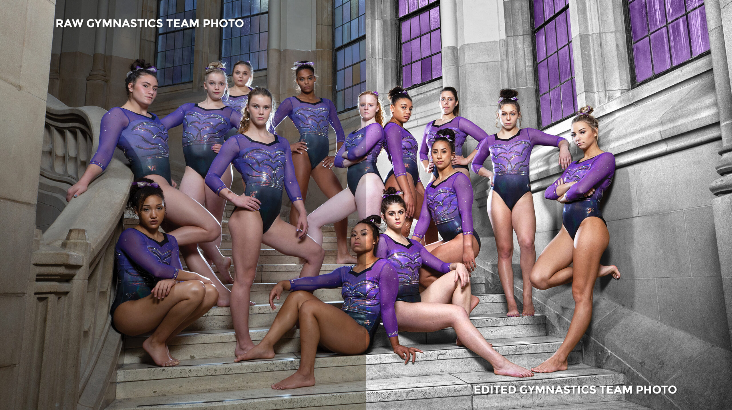
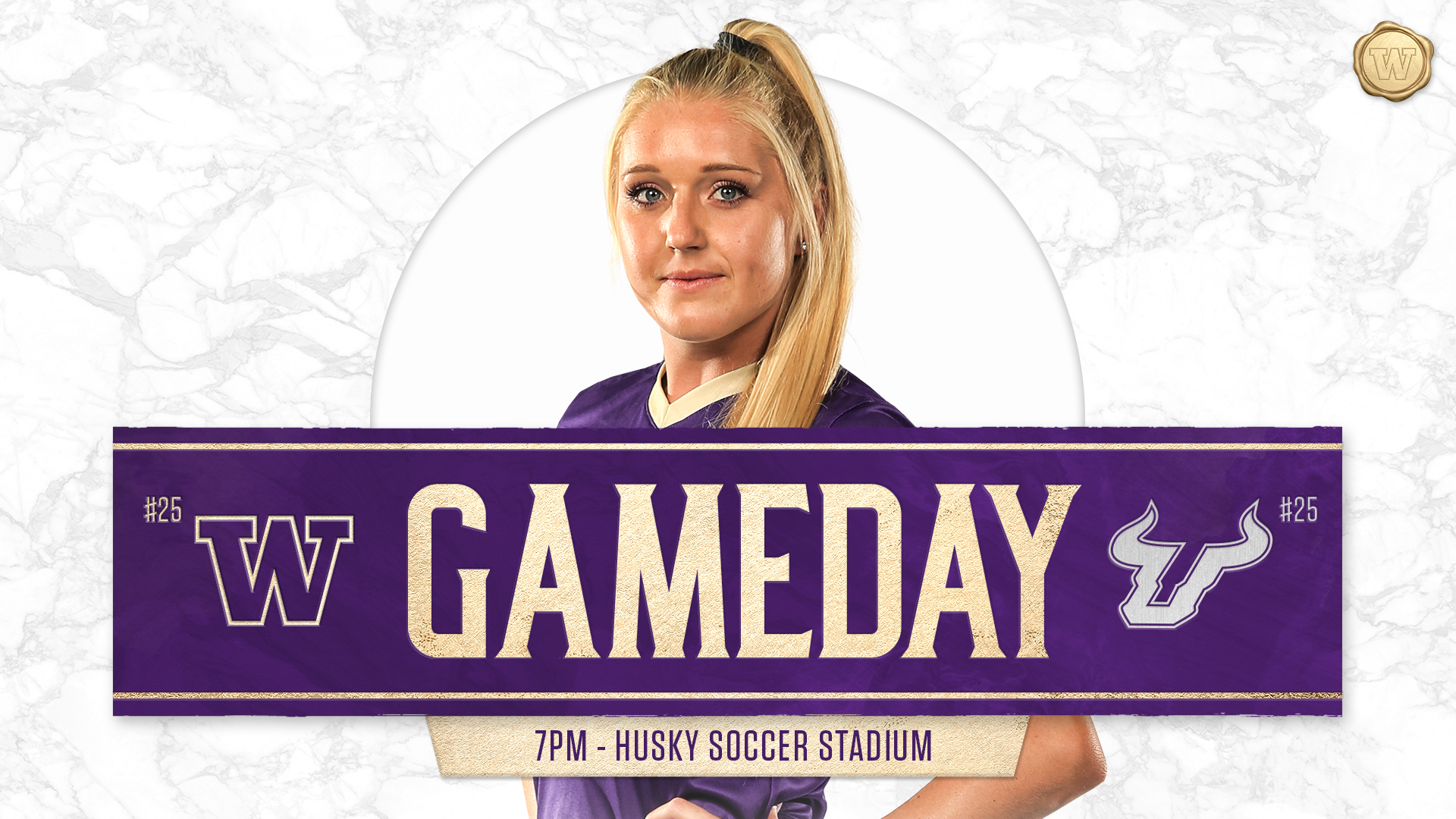
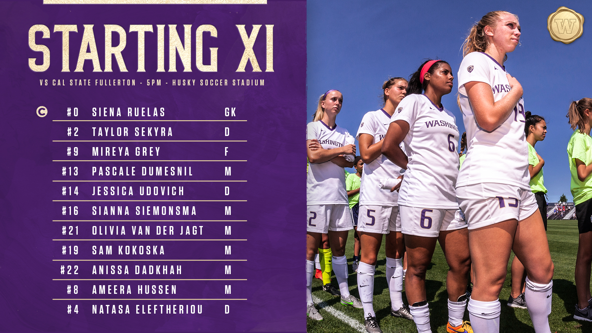
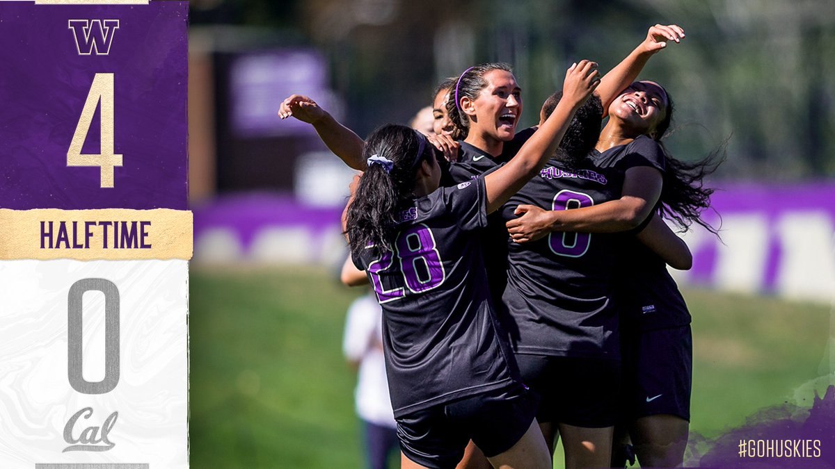
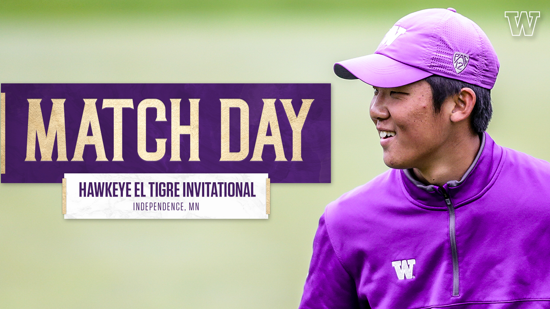
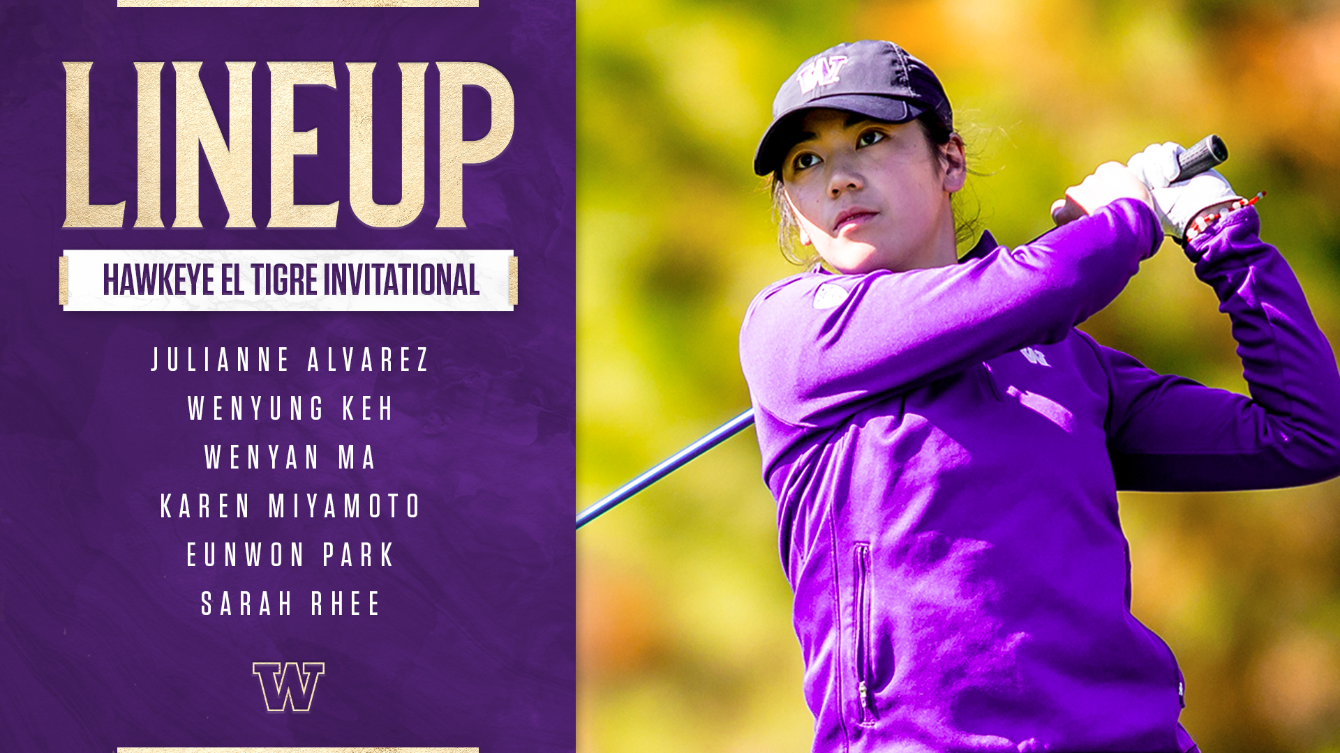
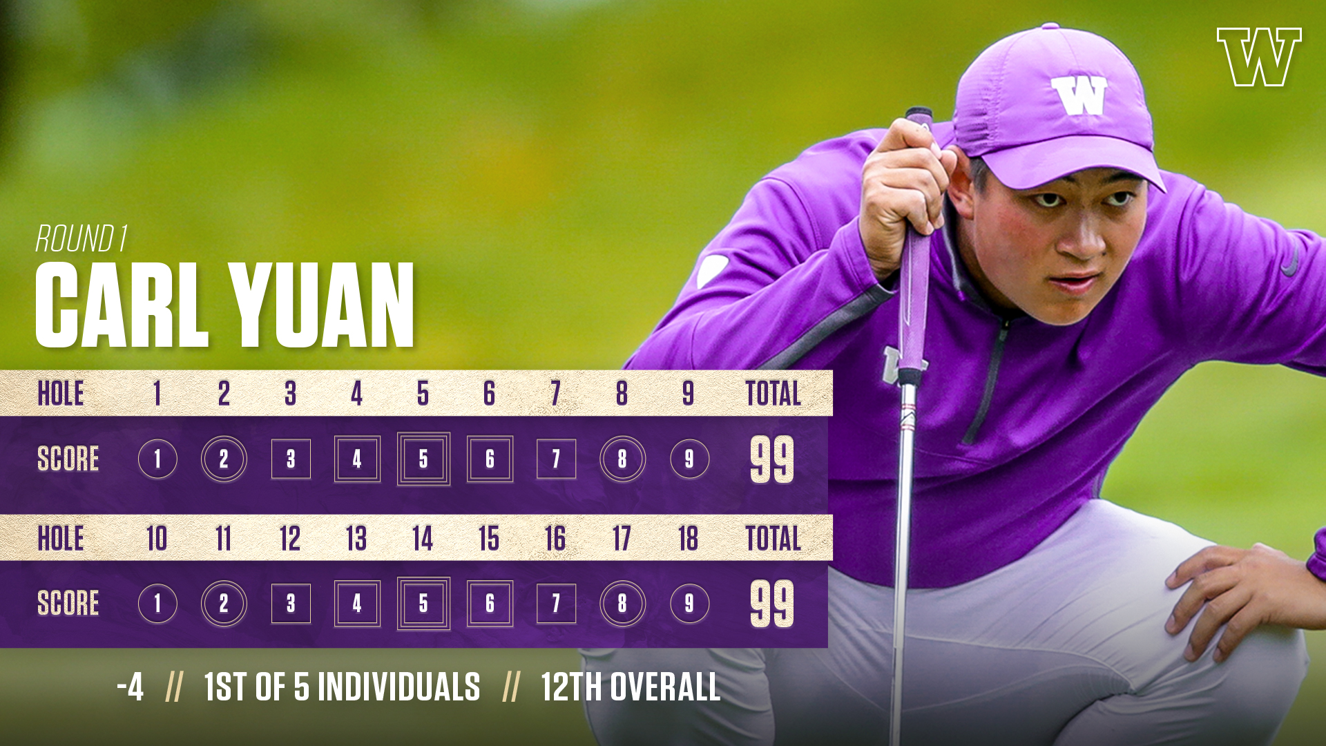
During my time with the University of Washington’s Athletic Department, I was given the opportunity to build and create the 2018-19 branding campaign for our olympic sports. This branding would encompass all of our athletic programs, excluding football and men’s basketball, and span across all mediums (print, digital, social media, etc.). This process was a very growing and challenging experience that included much research, experimentation, presentations, feedback, and critique. The goal of this branding was to visually represent the University of Washington’s student-athletes, campus, environment, and culture through a fresh, dynamic, and unique way. I also aimed to utilize UW’s branding and colors in order that we could become more consistent and easily recognizable. As displayed, this campaign continued to grow and evolve throughout the the year.

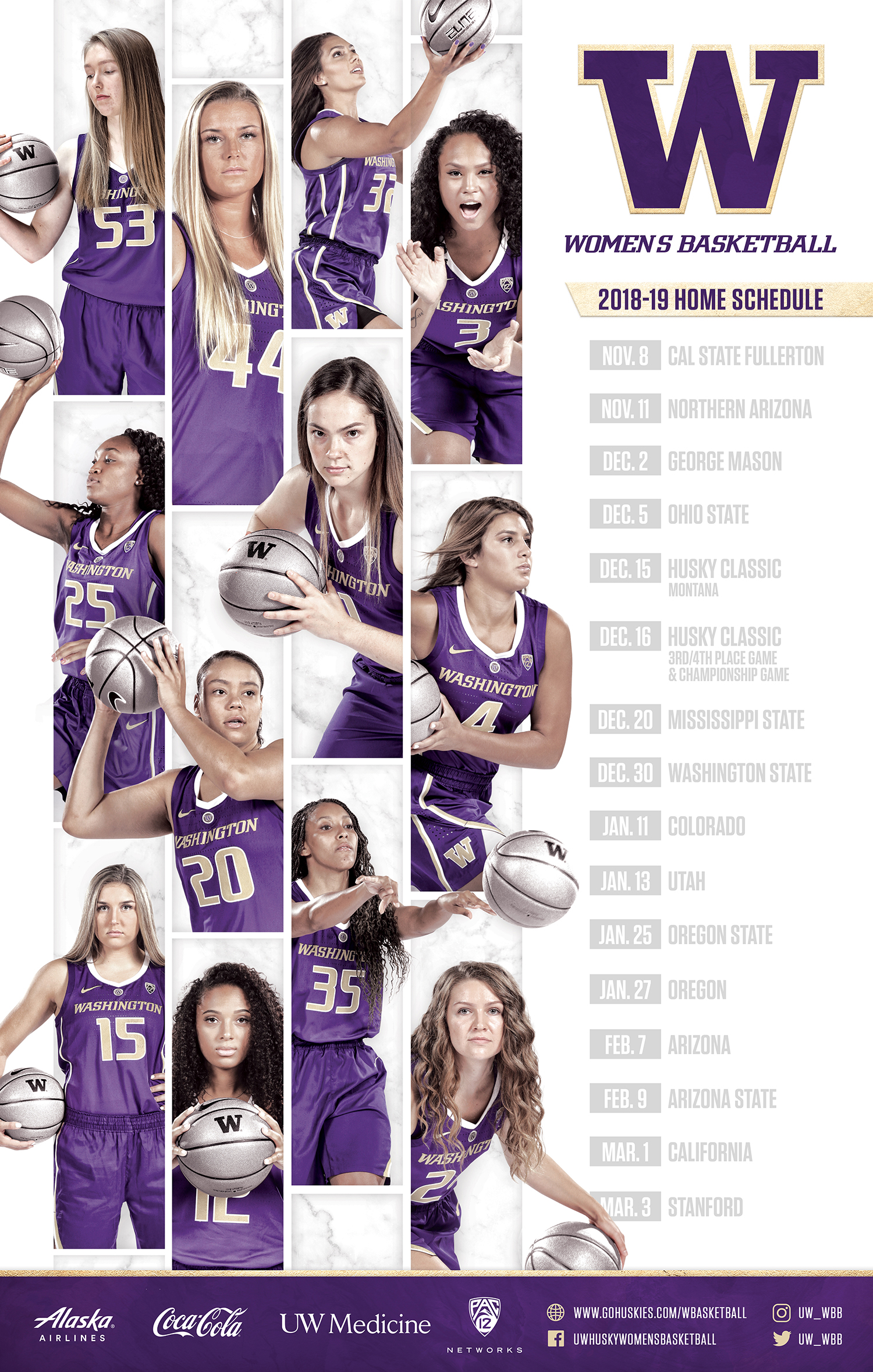
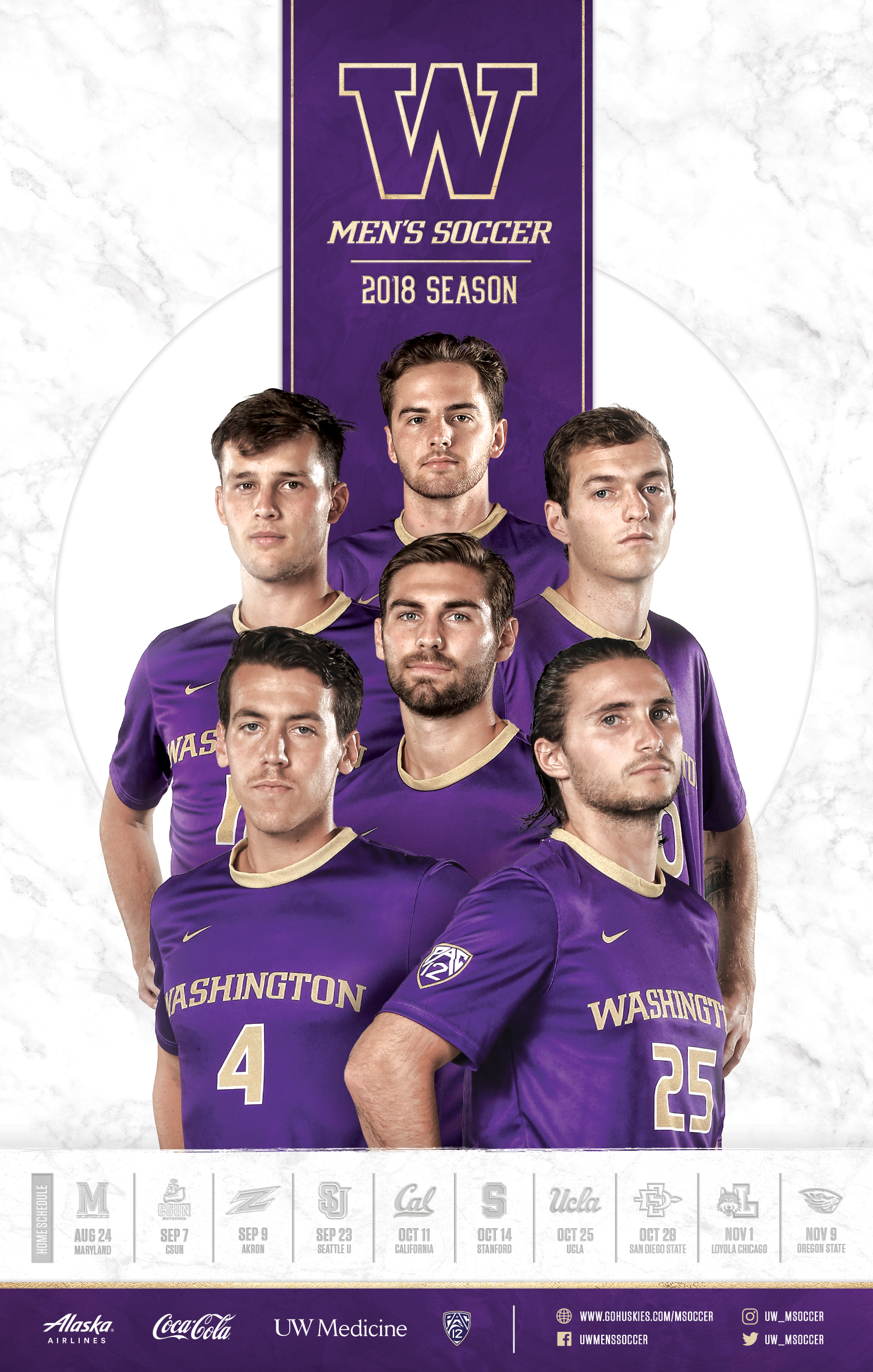
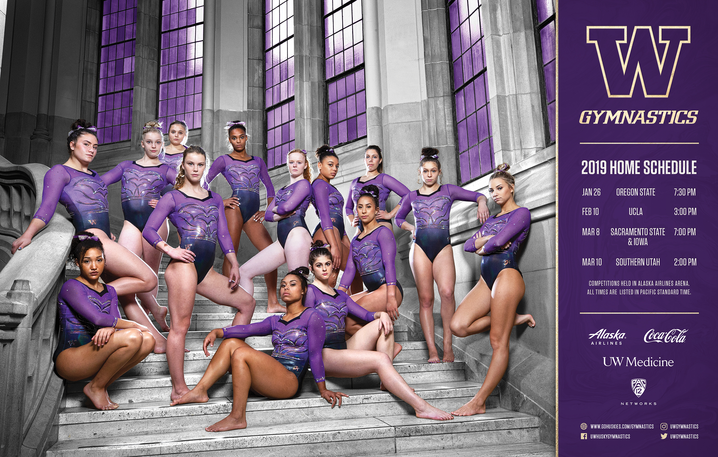
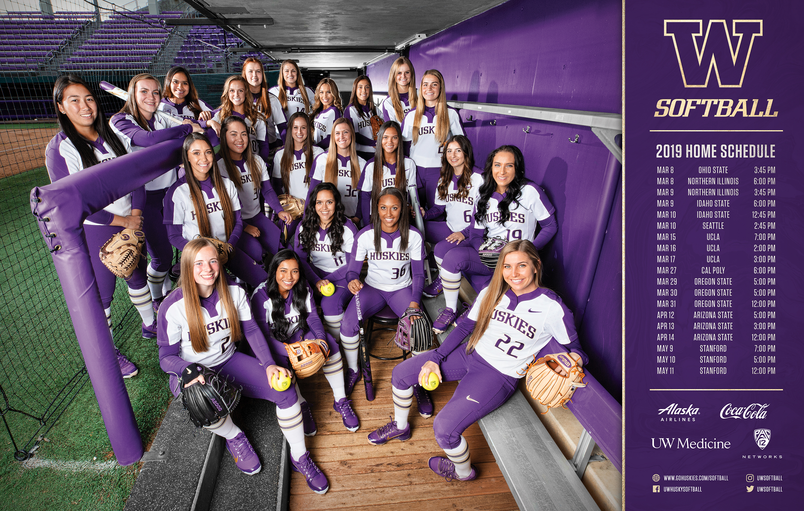

Programs, Posters, & Prints
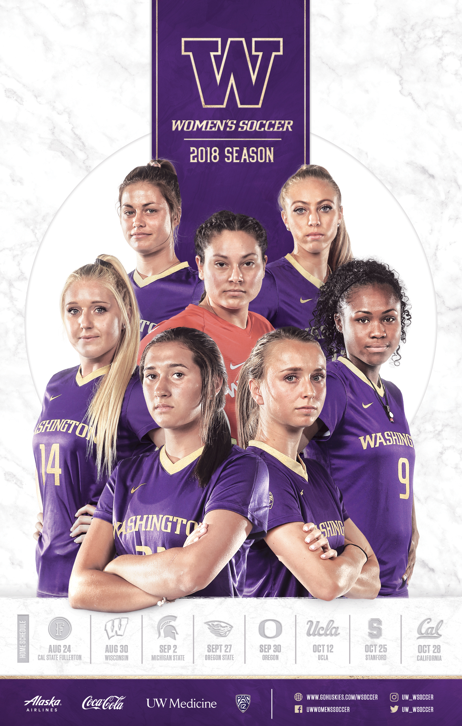
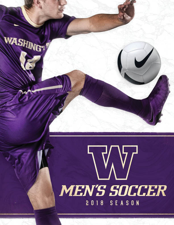
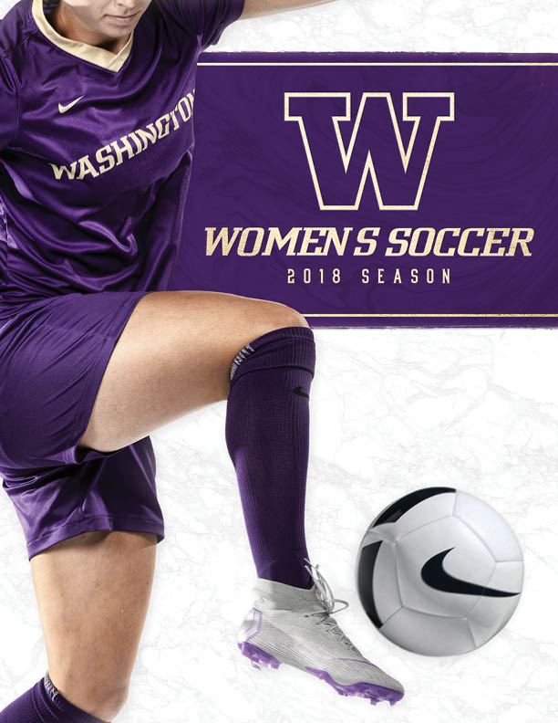
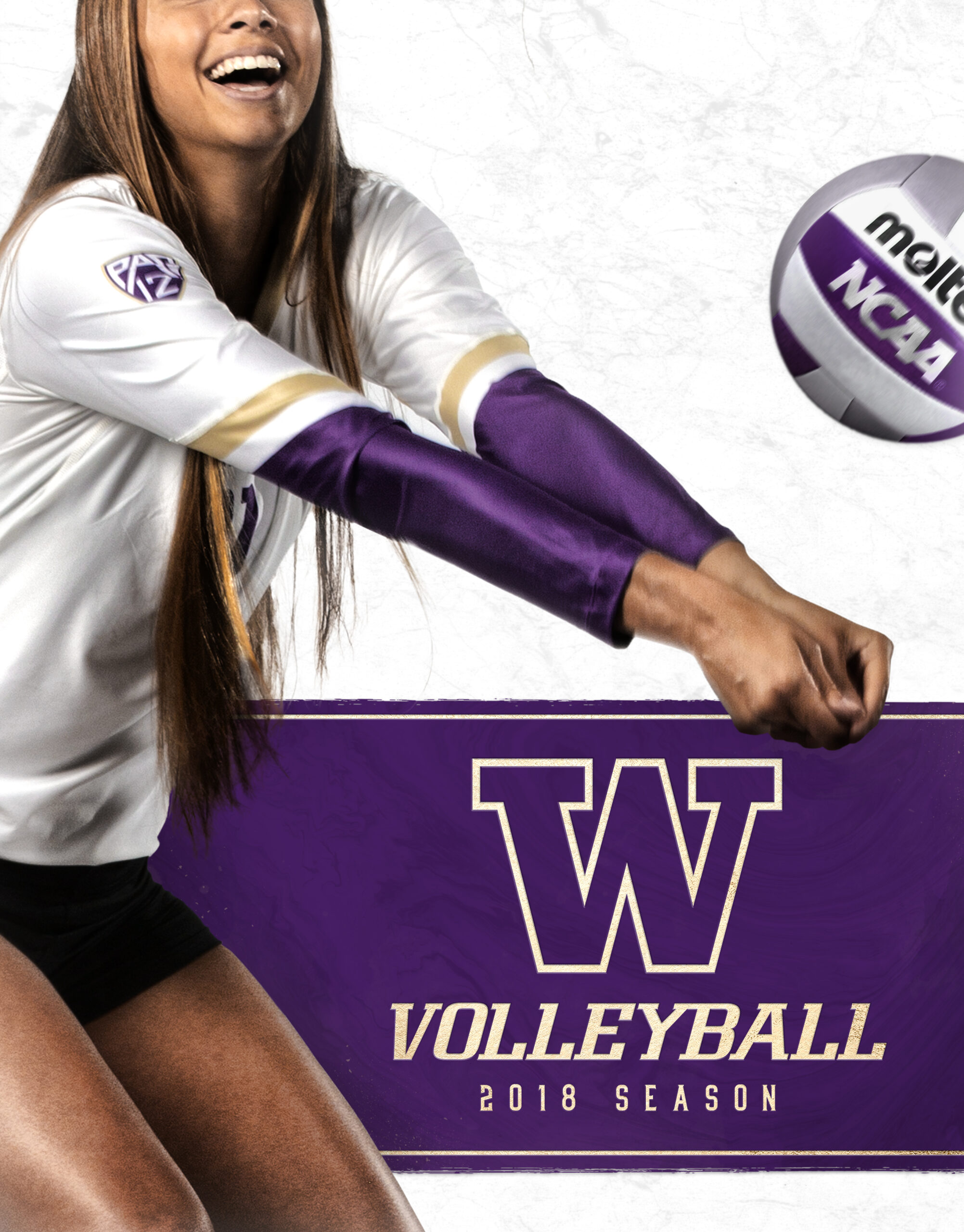
Most of the print materials that utilized this 2018-19 olympic sports branding were program covers and schedule posters. These were used as giveaways at various games and marketing events.
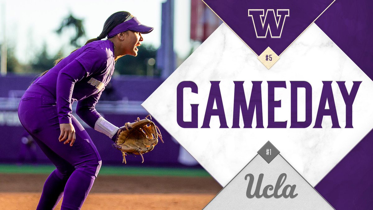
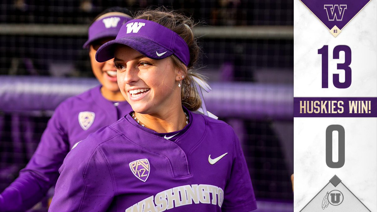
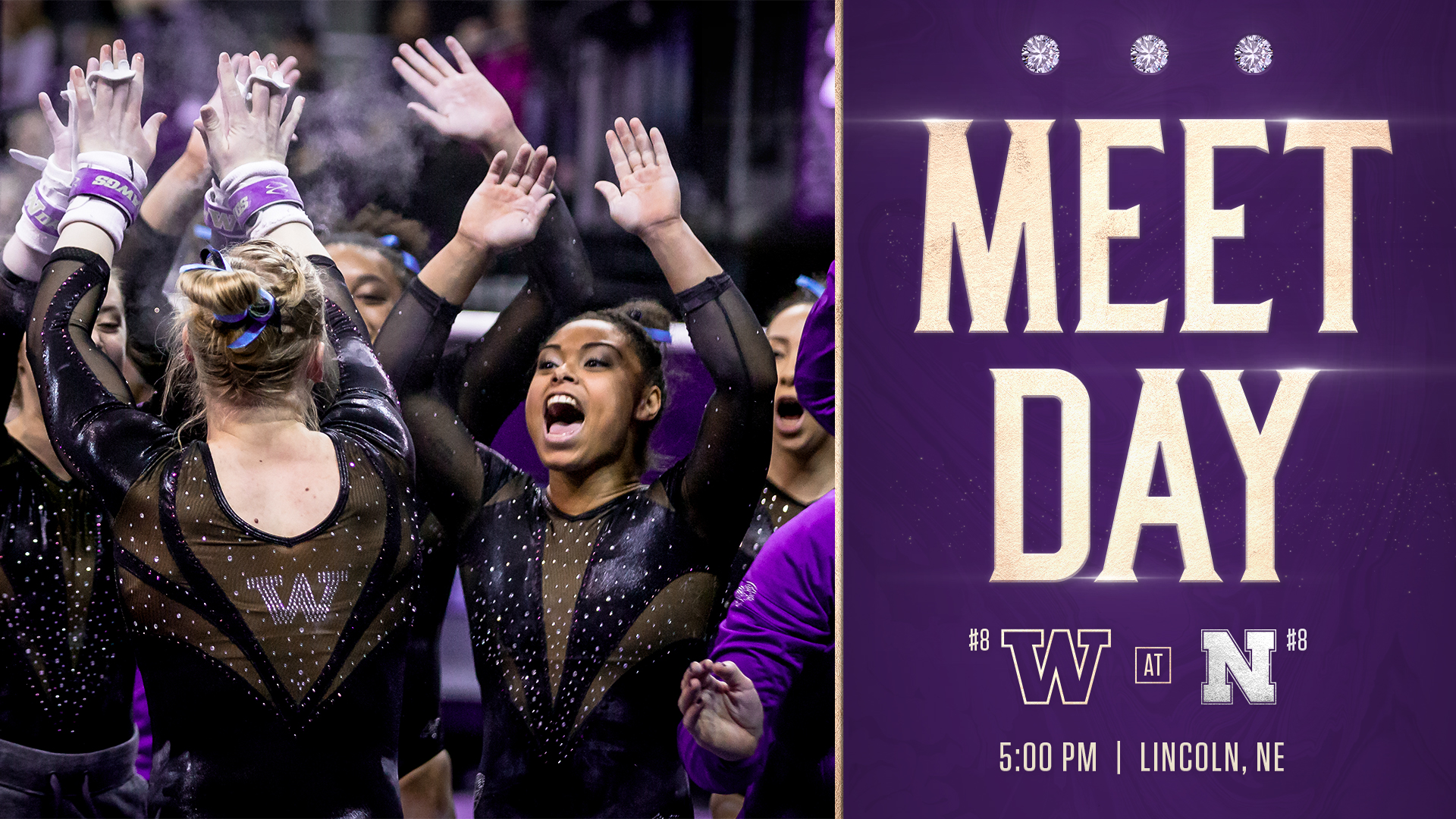
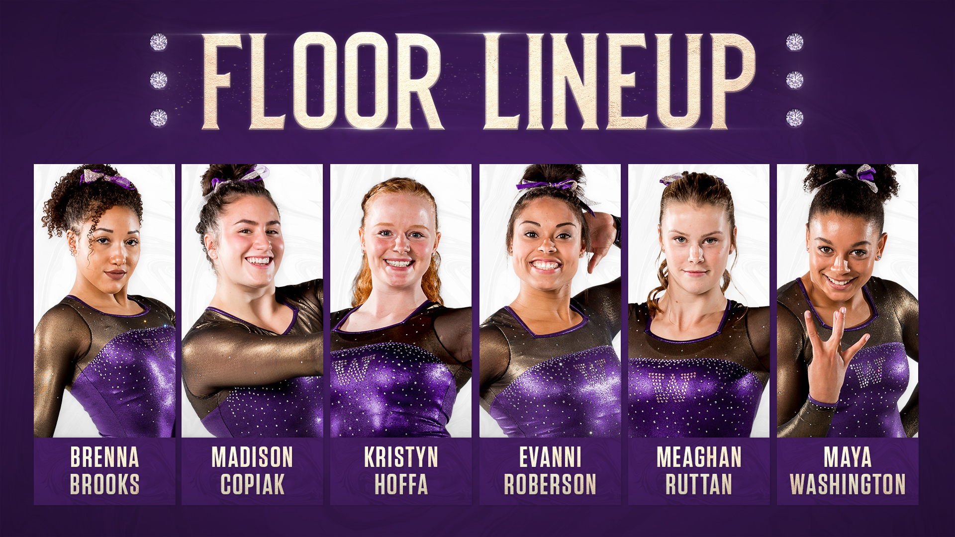
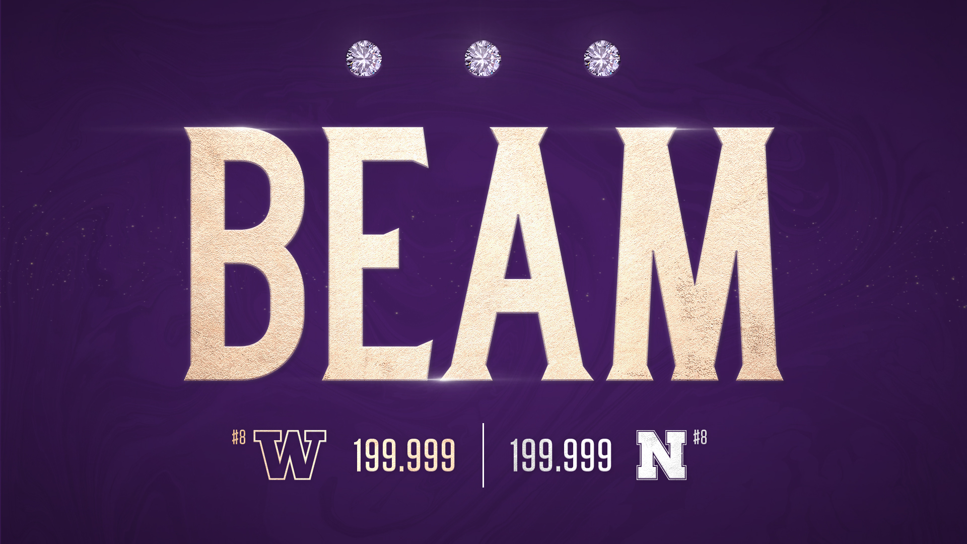
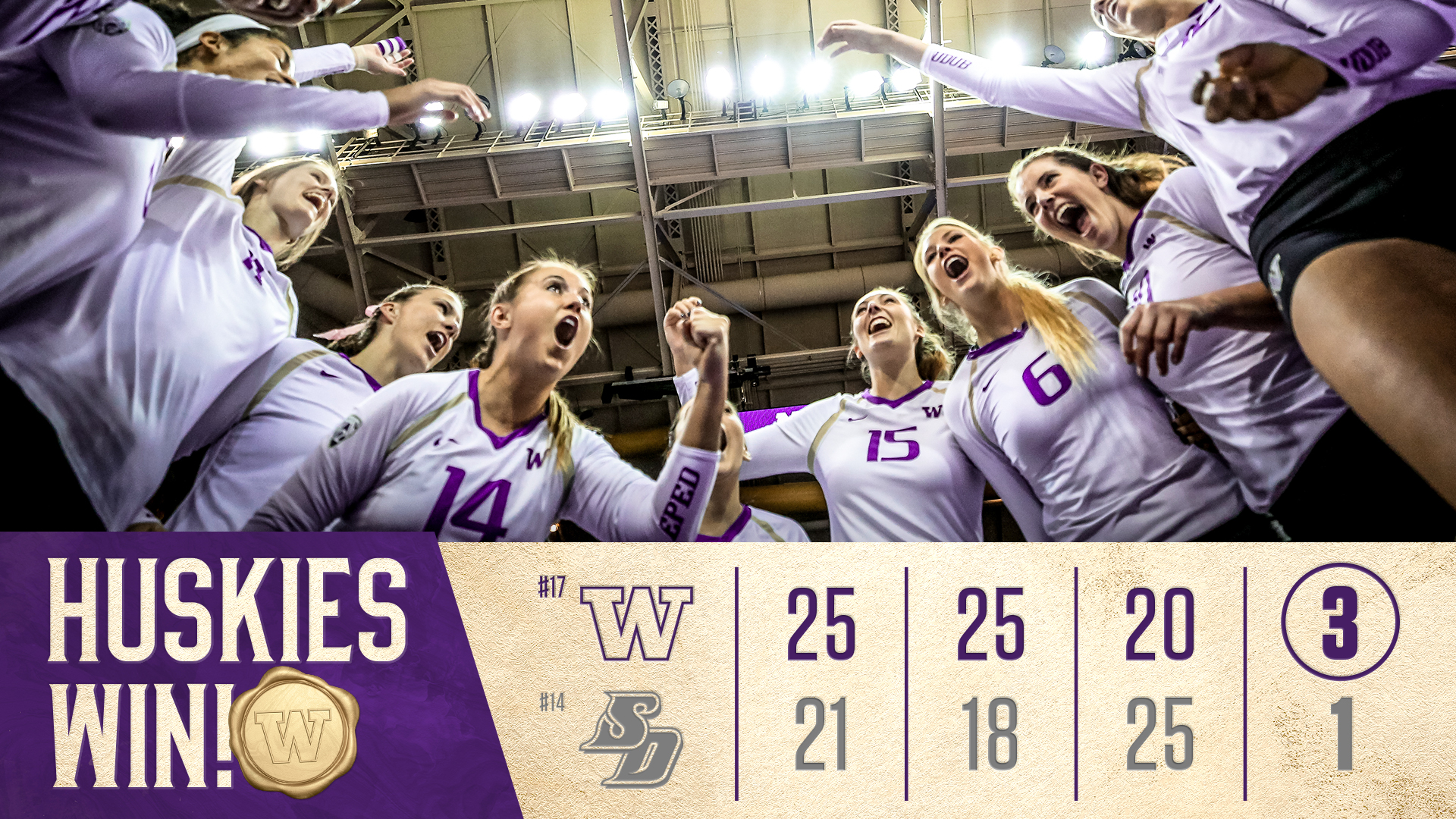
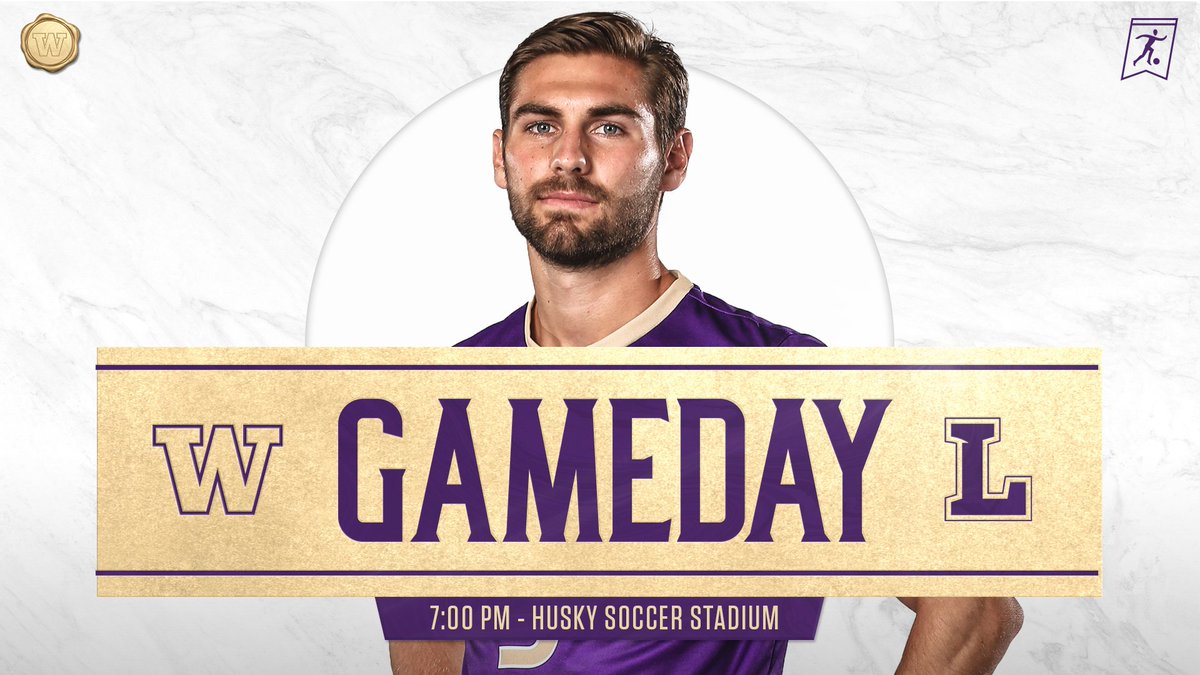
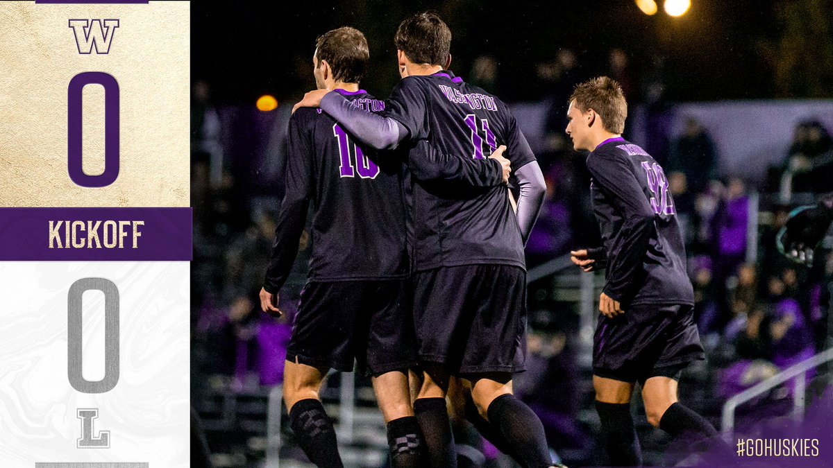
CONSISTENT, YET INDEPENDENT, BRANDING AMONGST ALL OLYMPIC SPORTS ON SOCIAL MEDIA
Chasing Championships
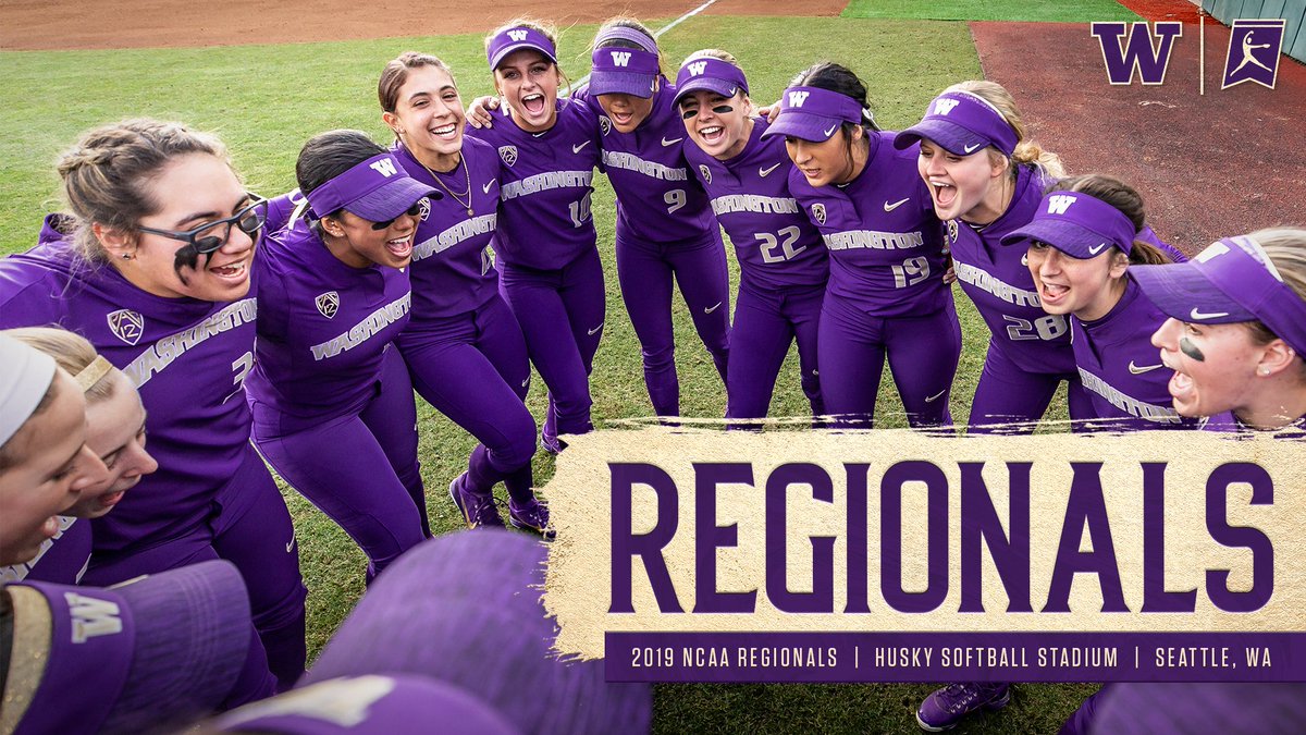
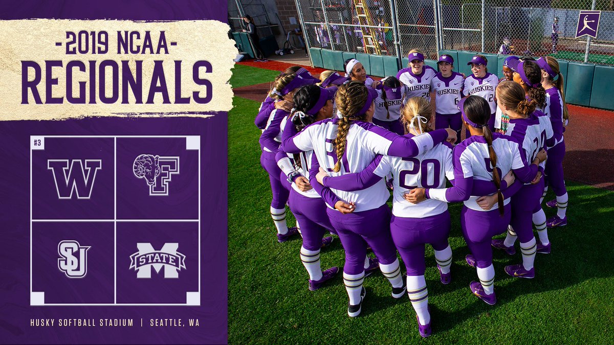
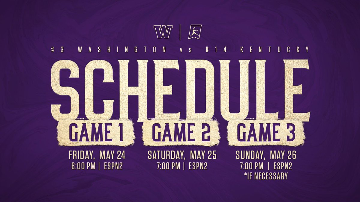
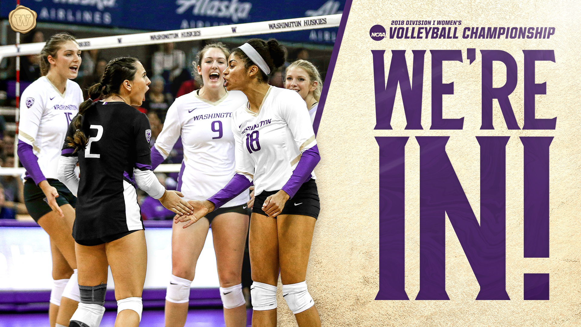
Multiple University of Washington athletic programs found success during their regular seasons, leading them to a postseason opportunity to win an NCAA championship title. The desire was to then evolve this branding to reflect that success, resulting in a primary focus on gold.
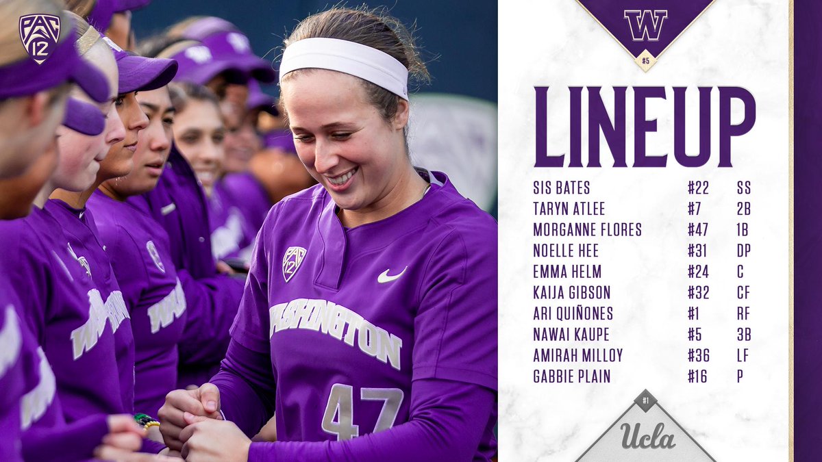
This more dominant usage of gold for the postseason varied amongst teams, as well. Fall sports, such as men’s soccer and volleyball, had a more emphatic approach as opposed to softball (as exemplified below).
A more comprehensive postseason packaging was provided for softball due to their ranking and high expectations for success.
